Already a qualifying Patreon member? Refresh to access this content.
2 thoughts on “Colour Tests for “Torso” Painting”
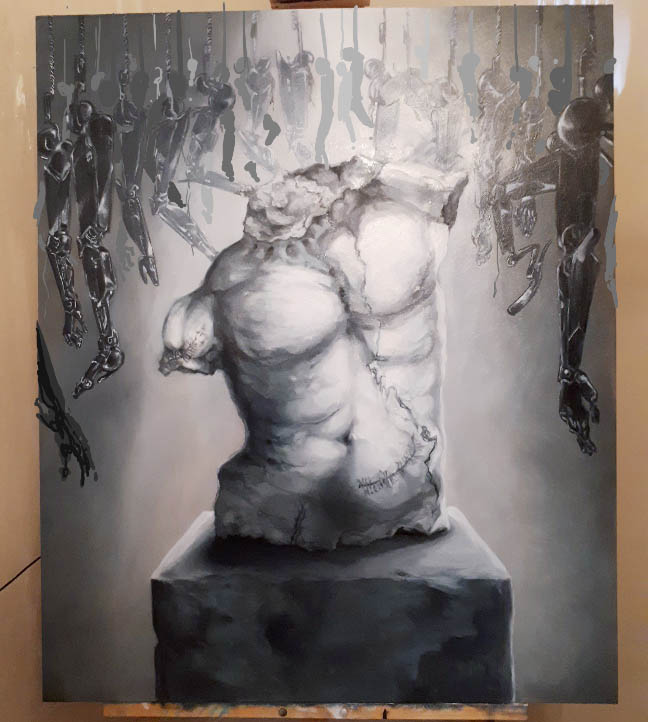
Less limbs. Numbers 1 or 3 for colour scheme… Unless those are the same colours 😐 if that’s the case then obviously that one.
The reason why I like this one the most: it’s solitary, clinical and sadly apocalyptic. It makes me think of a lab that was abandoned after trying to fit people with something beautiful. If we abandoned all efforts to better the lives of people who need help. I also like how cracked and imperfect the “perfect” body is.
All of this wrapped in a beautiful encasing.
Thanks for your input Leslie 🙂 It’s a little hard to see the difference between the two but it’s pretty much one has a brown base & the other a gray/blue base – the stone at the bottom.
I like that thought. When people share their thoughts like this, it lets me know if what I’m thinking is actually translating through the painting, which is super helpful. One of the thoughts I have is just the brutality of trying to alter a body “for the better” but ultimately failing along the way because the process is so trail & error.
 Unlock with Patreon
Less limbs. Numbers 1 or 3 for colour scheme… Unless those are the same colours 😐 if that’s the case then obviously that one.
The reason why I like this one the most: it’s solitary, clinical and sadly apocalyptic. It makes me think of a lab that was abandoned after trying to fit people with something beautiful. If we abandoned all efforts to better the lives of people who need help. I also like how cracked and imperfect the “perfect” body is.
All of this wrapped in a beautiful encasing.
Thanks for your input Leslie 🙂 It’s a little hard to see the difference between the two but it’s pretty much one has a brown base & the other a gray/blue base – the stone at the bottom.
I like that thought. When people share their thoughts like this, it lets me know if what I’m thinking is actually translating through the painting, which is super helpful. One of the thoughts I have is just the brutality of trying to alter a body “for the better” but ultimately failing along the way because the process is so trail & error.